Comparing Temperature Graphs
- Sep 1, 2023
- 1 min read
Updated: Feb 18, 2025
Scientists represent temperature data in several ways.
Examine the two representations below. Compare the way the data are represented in the map to the way they are represented in the graph. Think about how these representations are different.
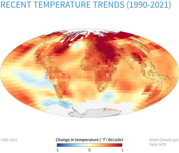

Now look more closely at the Washington, D.C., graph. Each dot is the average annual temperature for a year in Washington, D.C.
Discuss the following:
Look at the x-axis. What is it showing?
Look at the y-axis. What is it showing?
What do you see for the average annual temperature in 1998?
What does that mean in your own words?
What is predictable and not predictable about these data?
Credits
Climate Education Pathways
NOAA Climate.gov map, based on data from NOAA Centers for Environmental Information. Washington, D.C., data sourced from NOAA’s National Center for Environmental Information.